The Role of Color Psychology in Building a Memorable Brand
When you think of iconic brands like Coca-Cola, Facebook, or Starbucks, one thing instantly comes to mind: their colors. Red, blue, and green aren’t just design choices; they’re strategic decisions rooted in color psychology.
In branding, colors do more than beautify a logo or website; they shape perception, trigger emotions, and influence decisions.
Why Color Psychology Matters in Branding
Color psychology studies how colors affect human emotions and behaviors.
Since people form first impressions of a brand within seconds, the colors you choose could make or break that impression.
According to research, up to 90% of snap judgments about products can be based on color alone.
Your brand colors are often the first thing your audience notices, even before they read your tagline or interact with your product.
That’s why successful brands use color to communicate identity, build trust, and stay memorable.
The Emotional Impact of Colors
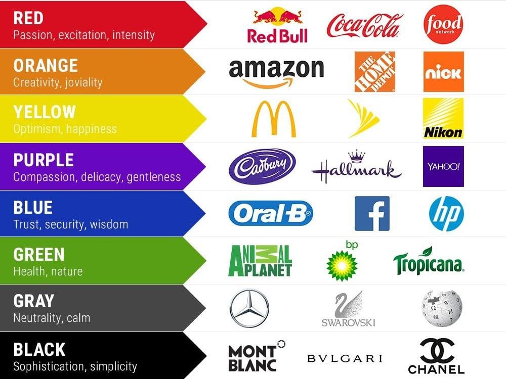
Each color carries its own meaning and emotional weight. Here’s a quick breakdown:
- Red: Passion, excitement, urgency. Often used in sales, fast food, or entertainment.
- Blue: Trust, reliability, calmness. Popular in tech and finance industries.
- Green: Growth, health, freshness. Common in eco-friendly and wellness brands.
- Yellow: Optimism, warmth, energy. Perfect for brands that want to appear friendly and approachable.
- Black: Sophistication, power, elegance. Used by luxury and high-fashion brands.
- Purple: Creativity, royalty, imagination. Favored by brands targeting innovation or premium experiences.
How to Use Color Strategically in Branding
- Know Your Audience – Different cultures and demographics interpret colors differently. Always research what your target market resonates with.
- Align with Brand Personality – If your brand is playful, yellow or orange may work better than navy blue. If it’s professional, cooler tones like blue or gray might be more suitable.
- Maintain Consistency – Use your brand colors across your logo, website, social media, and packaging to reinforce recognition.
- Don’t Overcomplicate – Stick to a primary color palette with one or two supporting shades. Too many colors can dilute your identity.
Real-World Examples
- Coca-Cola (Red): Creates excitement and energy, pushing people to “share a Coke.”
- Facebook (Blue): Instills trust and calmness, essential for a platform that connects billions.
- Starbucks (Green): Represents relaxation and growth, aligning with its “third place” concept between work and home.
Final Thoughts
Color isn’t just a design element; it’s a strategic branding tool. The right palette can amplify your brand’s message, create emotional connections, and keep you top-of-mind with customers.
If you want your brand to be memorable, start by asking: What story are my colors telling?
At Bluewave Digitals, we help businesses craft powerful brand identities that go beyond logos and taglines using design, color, and strategy to create lasting impressions.


